The illusion of speed – why perceived performance matters



Time is relative.
We have all heard this expression a million times before. Many years ago, some German dude went on and on about it, and even developed some theories about the same thing.
But what does it actually mean? With the risk of going all “Neil deGrasse Tyson” and start answering questions that nobody has asked, we can circle back to the aforementioned German dude.
The German dude, let’s call him Albert, had a secretary who got burdened with questions from reporters about the meaning of relativity. To help her out, Albert told her to simply answer these questions with the following example:
“When you sit with a nice girl for two hours you think it’s only a minute, but when you sit on a hot stove for a minute you think it’s two hours. That’s relativity.”
Interesting. This means that how we perceive time depends on our frame of reference. Moreover, the time we see on a clock doesn’t necessarily reflect our “brain's time” (psychological time).
“Cool stuff, nerd. But what the heck does this have to do with website performance?”.

Hang on, hang on, I’ll get to it. Just like taking your partner on a date, we must first set the mood. So let me light some candles and throw on some Barry White before diving into it.
When we talk about web performance, we often tend to focus solely on the metrics. “What is your Lighthouse score? What about your LCP? And have you optimized your FID?” often gets thrown around.
We are so enthralled in those goddamn Lighthouse scores, that we risk forgetting about the user.
“Wait, what? But I do this FOR the user!”. Yes, and that’s great. Optimizing your web vitals is important to the user experience, but it doesn’t tell you whether the user perceives your website as fast or slow.
You can have two websites with identical web vital metrics, meaning one loads just as fast as the other, where one is perceived as fast by the user and the other as slow.
I know, it’s weird.
We call this perceived performance. Where traditional performance optimization focuses on objective speed, perceived performance optimization focuses on subjective speed, and according to Mozilla, it’s even more important than the “actual performance”.
“The perception of how quickly (and smoothly) pages load and respond to user interaction is even more important that the actual time required to fetch the resources.” – MDN Web Docs.
Just like any other subject in tech, the rabbit hole goes quite deep when we start looking into perceived performance. So deep in fact, that a 224 pages book called “Designing and Engineering Time: The Psychology of Time Perception in Software” has been written about it.
Therefore, we’re not going to follow the white rabbit to the end of the hole in this article, but merely glance into it… we simply don’t have the time (bad dum tss!).

What we want to do is to keep the user in a state of “flow”. But what is flow?
Authors Rina A. Doherty and Paul Sorenson describe flow in their paper “Keeping Users in the Flow: Mapping System Responsiveness with User Experience” as:
“…flow is commonly described as the natural, fluid state of being productively engaged with a task without being aware of the technology that is driving it. As such, if successful, technology can become virtually forgotten when a user is immersed in the experience, or is in the flow”.
A way to make sure we don’t break this flow is to avoid users going into the dreaded “passive state”.
The way humans perceive time depends on the activity they’re doing. An activity can be broken into two states – the active state and the passive state.
In the active state, we have a high level of mental activity, and in the passive state, our mental activity is low.
We often enter the passive state when we're waiting for something, for instance standing in a queue. Professor Richard Larson ran an experiment for this very thing. His research showed that we tend to overestimate the time that has passed in the passive state by a whopping 36% (Source).
“Okay, so avoid queues on my website. Got it. Why are you telling me this?”.
Because we are constantly switching between the active and the passive state – including when we browse the web.
We of course are in the active state when we are navigating the web. Can you guess when we enter the passive? Bingo. When we’re waiting for a page to load.
The good news is we don’t enter this state immediately. It takes about a second for us to transition to this state, according to research done by the Nielsen Norman Group.
This means, that whenever the load time for a page is 1 second or more, we risk the user entering the passive state. What’s worse is, they experience the load time as much longer than it is.
As we saw, people on average overestimate the passive state by 36%. If we have a page that takes 4 seconds to load, the user will actually experience this as 5 seconds (25% slower than it really is).
The first second is in the active state, but in the next three seconds, the user risks moving to the passive state, which they then will experience as 4.08 seconds (3*1.36), which will result in a total perceived load time of 5 seconds (1 + 4.08).

You may be slamming your fist on the table by now, saying “TIME IS TIME! This isn’t fair!”.
And no, it isn’t (to both statements). But luckily, there are tricks we can use to overcome this hurdle.
We have two options here:
Let’s look into each.
The first thing we can do to keep the users in the active state is to be mindful of when we use loaders (spinner, loading bars, etc.).
I know this seems counterintuitive but hear me out. Remember the scene in the first “The Fast and the Furious”-movie (yes, I’m that old), where Jesse presses the Nitrous too early? Johnny then says “Too soon junior”, presses the nitrous, and overtakes poor Jesse. This is the same thing (except, not quite as cool).

We don’t want to show the loaders too soon.
We know it takes the user about a second to naturally transition to the passive state. This means that showing them the loaders when the wait (loading) is under 1 second, is not only unnecessary, but it can also harm the perceived performance.
Since loaders tell the user that “now they have to wait”, it will force them from an active state into a passive state. Therefore, we should avoid using loaders if we anticipate the wait time to be under a second.
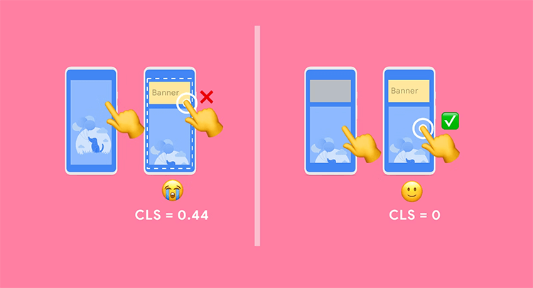
Image from Web.dev.
Content “jumping around“ can make it feel like the page is still loading and send the user into a passive state.
We call them layout shifts and they are often caused by images being loaded, which then causes the content to “jump”.
Another culprit can be custom fonts being downloaded. If the custom font isn’t the same size as the fallback font (the font being loaded before showing the custom font), it might cause layout shifts.
To avoid these layout shifts, make sure you give your image element a width and a height (required if you’re using next/image). For layout shifts caused by fonts, make sure to preload your custom fonts and find a fallback font that matches the custom font in size.
Layout shifts are measured in Google Lighthouse via the CLS (Cumulative Layout Shift) metric.
Another way to keep the user in the active state is by making sure your animations are smooth. If your animations don’t feel natural and don’t move how the user might expect (for instance a slight lag), this can cause the experience to feel slow. If the animations start feeling “laggy”, it can cause the user to transition to the passive state.
So, make sure your animations aren’t too complex for the user and that they feel natural. A good way to provide a smooth experience is to render your animations at 60 fps.

Image from Adobe.com.
The secret to keeping the user in the active state is to provide immediate feedback. The user likes to know, that something is happening at the other end when they take an action.
This immediacy keeps the users from going into the passive state.
A super easy way to implement this in your UI is to add an :active selector to all your button and link elements.
The active pseudo-class represents that an element has been activated by the user. Changing the background color of the button (or shadow, border color, etc.), when the user clicks (activating the :active pseudo-class), provides the user with feedback, that something is happening.
As the word might suggest, preloading means that we load something in advance. There are two ways we can think about preloading. One way is that we start loading something which we will need later on. Another way is to show something before it’s done loading. Let’s look at each one.
In the first case, loading something before we need it, we anticipate what the user will do next. Instagram for instance does this by beginning to upload your image as soon as you select it. They anticipate you will publish your post, so they do the heavy work before you hit the post button.

We can do a similar thing on our website by preloading pages before users navigate to them.
Frameworks like Next.js have this feature built into their router. In Next.js, when using next/link, you can add the “prefetch”-prop. By adding this, any link that is in the viewport (initially or through scroll) will be preloaded.
In the second case, we start showing something before it’s completely done loading. We see this all the time on various streaming platforms. If you open a YouTube video, it will start playing, even though it hasn’t downloaded the whole video. Instead, it will estimate how fast you can stream it and wait for that portion of the video to be loaded.

This is the same, as when we chose to load above-the-fold content first on our website. We want the user to be able to interact with the page right away, without having to load the entire page. A way we achieve this is by lazy loading images and components, as well as deferring non-essential scripts.
Okay, now let’s look at how we can make the passive state feel faster.
All right then, it’s time to manipulate time. Don’t worry, we’re not going to create any time paradoxes – we wouldn’t want to unravel the very fabric of the space-time continuum and destroy the entire universe (Great Scott!).
Instead, we will use smoke and mirrors to make the passive state feel much faster than it really is. Let’s first look at a real-world example.
Back in the early industrial age, buildings started growing taller and taller, which meant more people started using elevators. Back then elevators were quite slow, so naturally, people did what people do best – they began complaining about it.
As a result, elevator companies started tackling this problem by designing elevators that were faster and safer. Unfortunately, at the time this was a very expensive thing to do.
However, in another elevator company, one engineer had a different take on the problem. Speaking like a true (software) engineer he blamed the user, as he said:
“I think our elevator speeds are just fine, people are crazy.”
This guy was basically a real-life Principal Skinner!

His theory was, that the problem wasn’t about the elevators' speed (objective), but rather that the users thought it was slow (subjective).
So, while the other companies went off trying to optimize their motor and pulley design, this company tackled the problem differently – they wanted to solve why the user thought it was slow.
Turns out that being trapped inside a metal box suspended many meters up in the air, held up only by a metal wire, isn’t exactly fun. The time seemed much longer when you had nothing to do but stare at the wall, trying to cope with your fear of being trapped.
So how did they solve this problem? They installed mirrors.
Yes, mirrors. Seems silly, but that was really all it took. Suddenly the users perceived the elevator rides as much faster than before.
Now the users could look at themselves, check if their hair and makeup were okay, and become distracted by their own reflection. As an added benefit, it helped people suffering from claustrophobia since the space now seemed bigger than it really was.

And by that, we conclude today’s history lesson. Let’s look at what you can do to make the passive state feel faster.
If we can’t keep the users in the active state, we have to utilize loaders in the best way possible.
There are many ways to design a loading animation – just look at cssloaders.github.io.
Probably the most famous loading animation is the spinner. However, even a spinner can be designed in multiple ways.
If you look at the different variations, you will probably realize that you interpret some as slow, whereas other seems fast.
As we learned earlier, how an animation is designed can have a big impact on the user’s sense of speed.
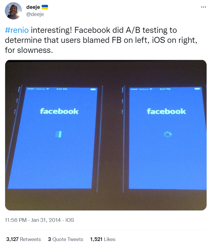
If you want to be devious like Facebook, you can even try to shift the blame of a slow site/app to the user’s own operating system.
Doing an A/B test, they found out that by mimicking the iOS loading animation, the user started to blame iOS for the slowness instead of Facebook. Oh Zuck, you sneaky Lizard-man.
Skeleton loaders, even though they might sound spooky and scary, are a fantastic way to make your website seem faster.
A skeleton loader is an animation placeholder that mimics the structure and looks of the content being loaded. They often have a gray color along with a pulsing or waving animation.
It gives the user an idea of how the content is going to look and feel.
You’ll see skeleton loaders implemented on big sites like Facebook, LinkedIn, Medium, etc.

Example of Skeleton loader from React Native Skeleton Content.
There are plenty of packages available for frameworks/libraries like React, Vue, etc., and if you’re using a UI framework, it might be built in, as Chakra UI has.
If your website or app has a multi-step process that takes time, it can be beneficial to tell the user what’s going on, instead of simply saying “loading”.
At Enterspeed, when bulk deploying schemas, we have implemented a loader that tells you if it’s validating or deploying schema, as well as how many schemas are left. Often you won’t get to see this, because it goes fast, but just in case you have a slow connection, you can see what’s going on.
Moreover, if the process takes more than 4 seconds, you should switch the spinner out with a progress bar, so the user can see the progress being made.

Image from Microsoft.com.
For processes that take a very long time, you can try to find a fun way to distract the user. A real-world example is the crosswalk in Germany with a built-in pong game.
To distract the user while they wait, you can show them a random fact (e.g., a random cat fact via the Cat Fact API), or maybe something related to your industry.
For instance, in a performance monitoring tool I helped build, we implemented a random fact about Conversion Rate Optimization, which changed every 10 seconds, while the user waited for their report to be generated.
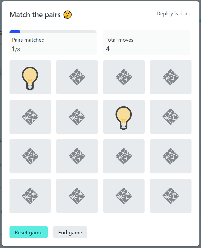
Netlify also does a great job distracting the user, while you wait for your site to deploy. They give you the option to play a game while you wait, and even show you the deployment process meanwhile – how cool!
It’s always quite difficult to measure and quantify a subjective thing. The same goes for perceived performance.
We can interview our users and ask them if a site felt slow or fast, using feedback plugins, or by performing user tests. However, this can be difficult to do for smaller websites
Luckily, we also have metrics available that we can use as indicators for perceived performance.
I began the article by saying “We are so enthralled in those goddamn Lighthouse scores, that we risk forgetting about the user.”
But truth be told, Lighthouse has done a lot to make sure that a website is perceived as fast, rather than just loads fast.
Back in the day, we used to simply measure load time and page size – these were the two metrics we were focusing on. That was until one day Google changed the way we thought about performance by introducing Google Lighthouse (…and of course by making it a ranking factor, which we couldn’t ignore).
The metrics we find in the Google Lighthouse performance report are a way to quantify and measure user experience, here including the perceived performance.
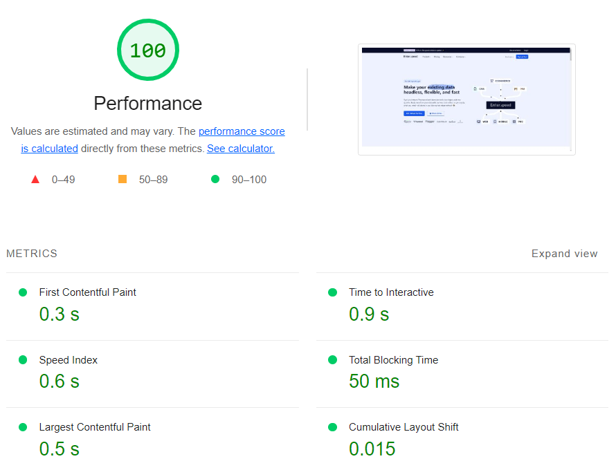
Some of the metrics you can use as indicators are:
You can run a Lighthouse test via Chrome DevTools or via PageSpeed Insights.
Just remember, these are only indicators and not a metric on how fast your site “feels”. For this, you need to ask the users.
The way humans perceive time doesn’t necessarily match the time we see on a clock. The way we perceive time depends on the activity we’re doing.
Activities can be broken into two states – the active state and the passive state.
In the active state, we have a high mental activity, whereas in the passive state our mental activity is low. In the passive state, we tend to overestimate the time passed by an average of 36%.
We’re constantly switching between the active and the passive state – even when browsing the web. When we wait for a page to load, we risk moving into the passive state.
You can improve your website’s perceived performance by avoiding users switching to the passive state. If they do end in the passive state, you can make tweaks to make the passive state feel faster.
It’s difficult to measure and quantity perceived performance, instead surveys and user tests can be used. The metrics in Google Lighthouse can be helpful indicators for measuring perceived performance.
And since we're on the topic of speed, maybe you'd want to know how you speed up B2B pricing on your website.
A huge shout-out to Eli Fitch and his great video about “Perceived performance: The only kind that really matters”, which helped form this article!
The same goes for Raelene Morey’s fantastic article on “What is Perceived Performance and Why You Need to Optimize It”, and Luke Jones’s awesome article on “A Designer’s Guide to Perceived Performance”.
Y’all rock 🤘
Examples, as well as tips and tricks, have been shamelessly stolen from these great resources.

Loves optimizing and UX. Proud father of two boys and a girl. Scared of exercise and fond of beer.
© 2020 - 2026 Enterspeed A/S. All rights reserved.
Made with ❤️ and ☕ in Denmark.